

Jeff has spent his career sharing his style with the world — so it’s no surprise to say that we can all learn a little something from his creativity and flair.
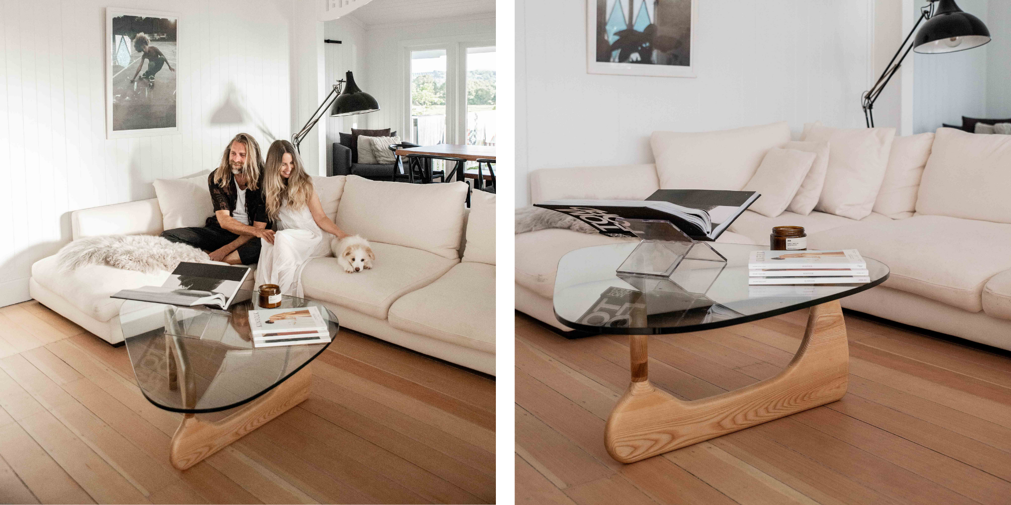
Recently, Jeff styled his own living and dining areas at home with LoungeLovers furniture. His effortless sophistication and breezy elegance shine through at every turn, showcasing just how chic our pieces can be.
Here are seven ways to style your home, inspired by the man himself.
A pale, breezy cream and white colour palette has been centre stage in the interior design world for years, and Jeff’s tableau of alabaster hues sets a statement: this trend isn’t going out of style any time soon.
To recreate this look in your home, begin with larger statement pieces and work your way out. This includes a spacious rug that will set the tone from the ground up.
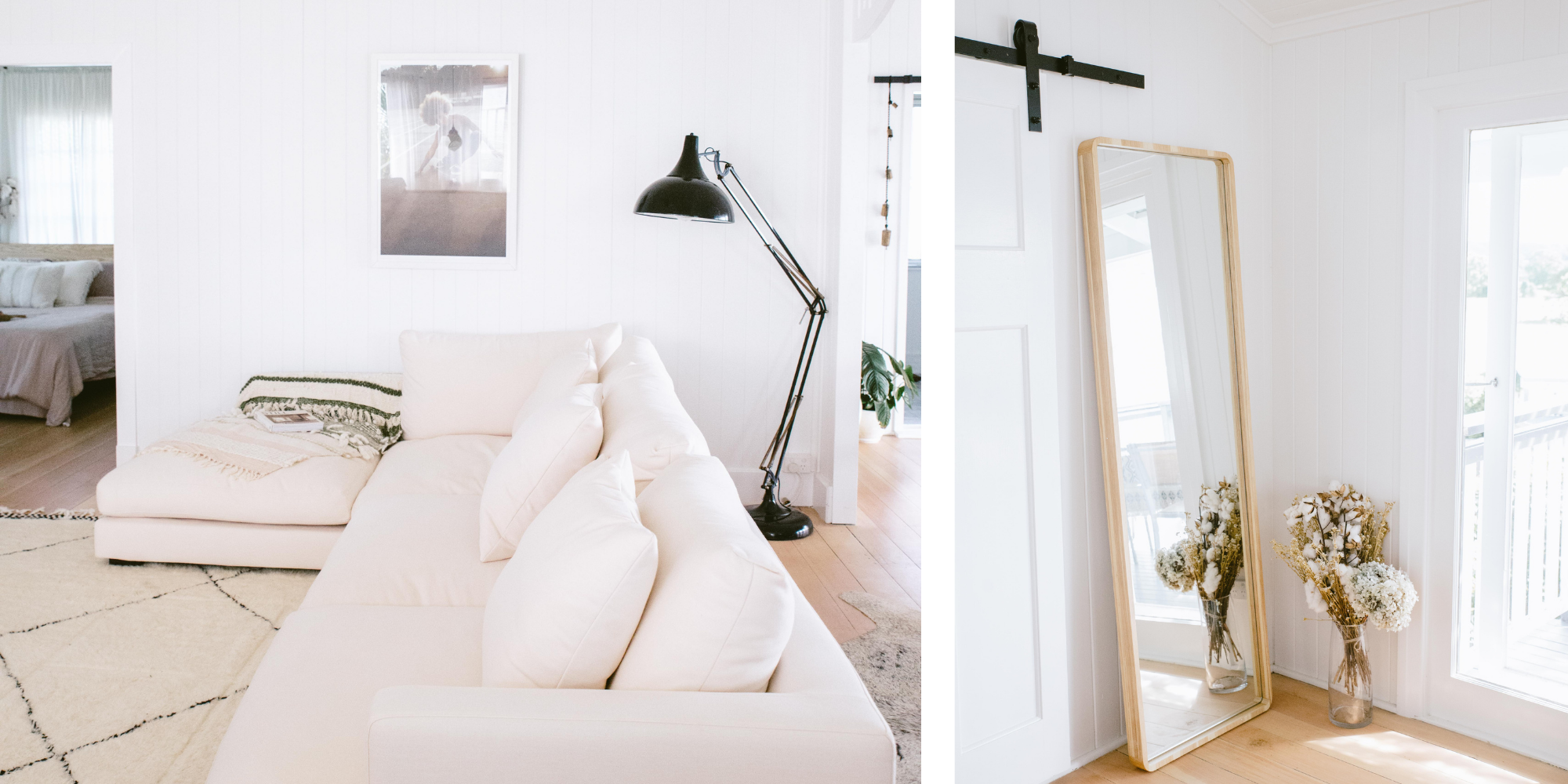
Set the scene: Jeff incorporates the Saffron Natural Rug into his home for a luscious soft touch underfoot and an unobtrusive, subtly stylish creamy hue that expertly frames the space.

Taking up most of the space and commanding the attention in the room is the Long Beach Corner Sofa in Bellevue New Ivory, a corner sofa that oozes style – and strongly encourages relaxation.
As Jeff so easily proves, an immensely comfortable and welcoming sofa can be just as chic as its more formal, upright couches.
This design offers laid-back luxury, with soft seating, ample cushions, and a low profile that creates a sense of easy style and comfort you can sink into.
One look at Jeff’s living areas and it’s easy to feel one thing: relaxed.
As well as the breezy pale tones and open layout, the constant use of organic shapes plays a role in this overwhelmingly comfortable atmosphere.
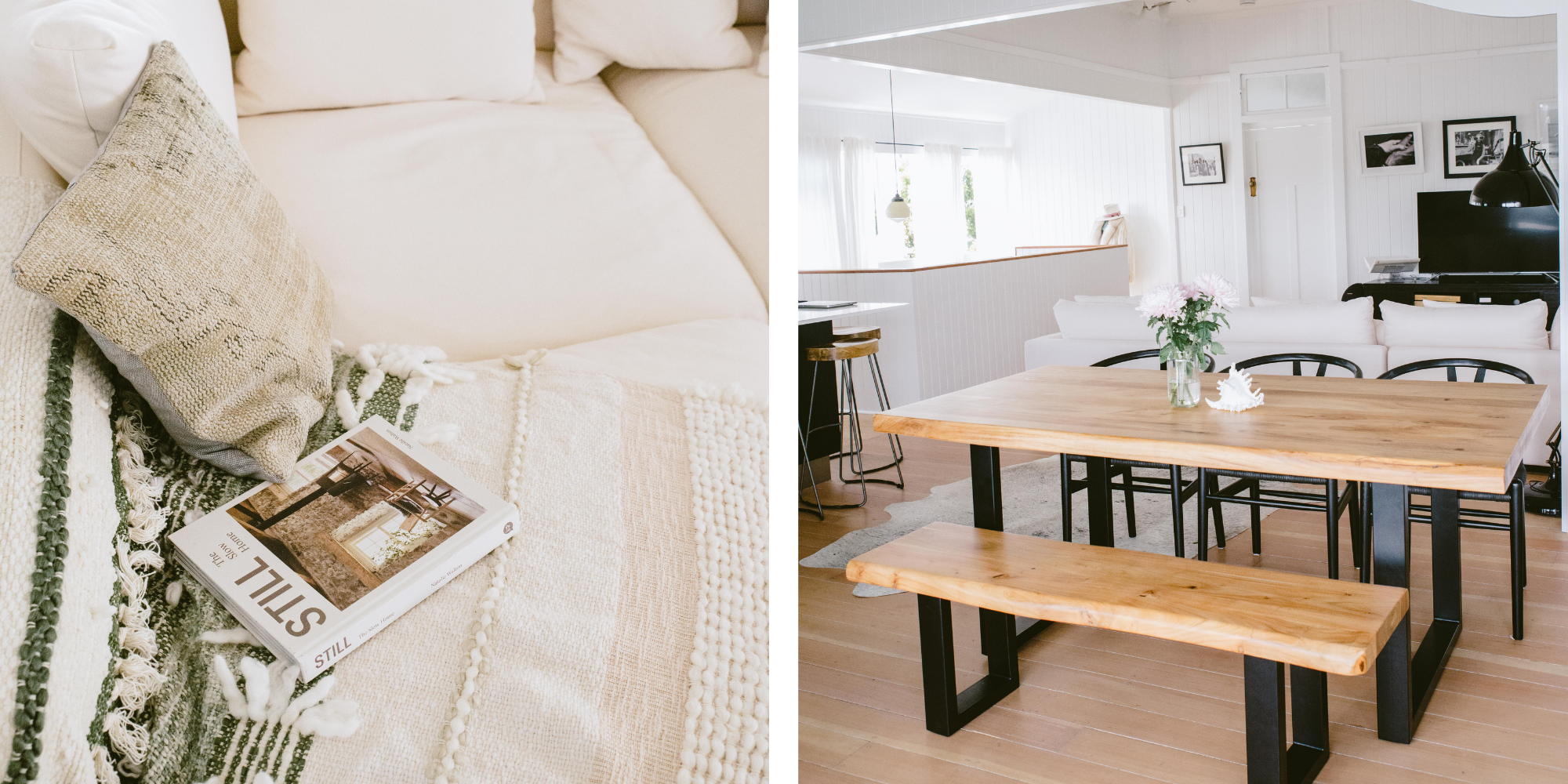
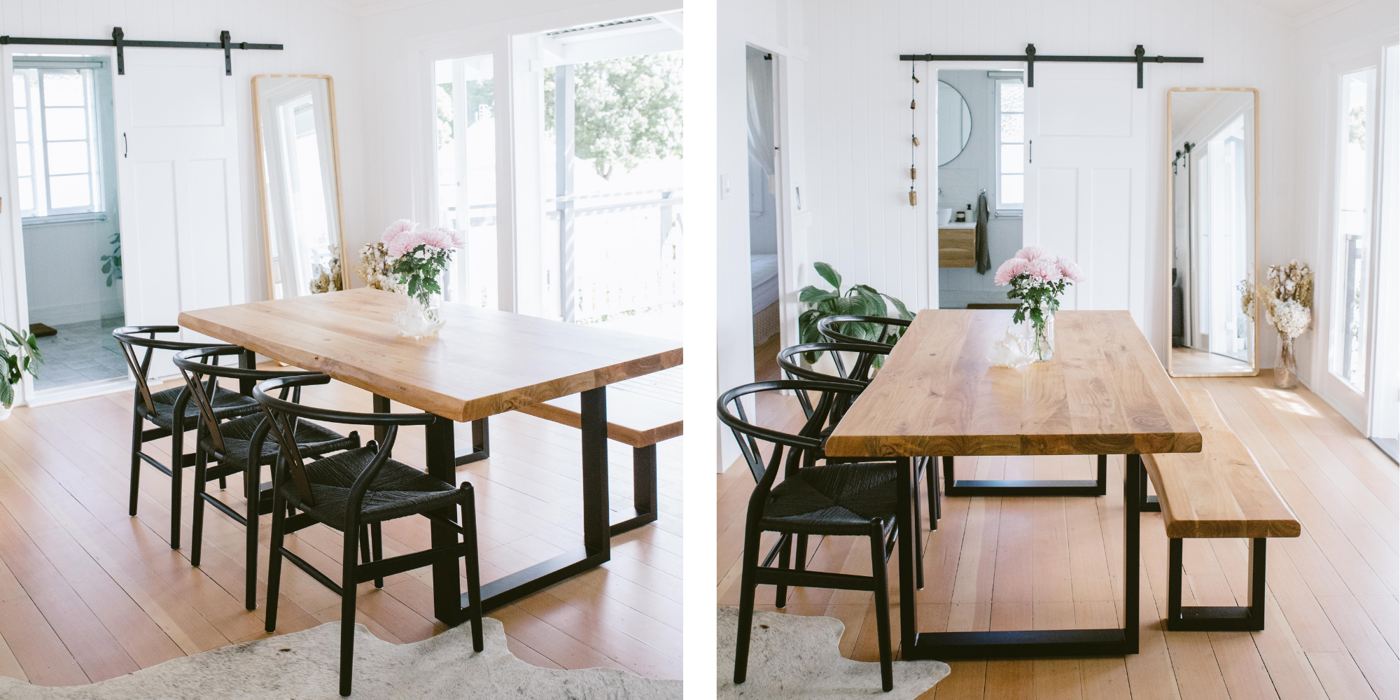
You can see this everywhere from the curved edges and plush shape of the couch, to the bell-shaped lamp head, the semi-circle backs of the black Ark Dining Chairs, and the natural, living edges of the Sierra Dining Table.
Keep it curvy: The wall mirror offers a subtle curve around the edges, not quite a circle but not quite a square, for a natural shape that helps to brighten up any space and add interest.

Creams and whites offer an elegant, breezy base, but a space also needs touches of colour to create points of interest and give the room a more dynamic look.
For that, Jeff has incorporated select touches of natural tones and deep blacks throughout the décor.
“Having black dining chairs is quite the contrast against the ivory sofa. Black accents via accessories on the coffee table, TV and floor lamp combine nicely with the table legs and chairs,” says Jeff.
From the black standing lamp and the black and white striped throw rug laying casually over the arm of the sofa, to the tall floor mirror framed by pale natural timber and the organic hue of the Sierra Dining Table, each element complements the rest.

It’s the oldest design tip in the book, but it never hurts to have such a beautiful reminder.
Jeff’s living areas are an ode to pared-back style. There are well-considered pieces of décor to amplify the room, but it is never cluttered, busy, or overdone.
“We are not pure minimalists; however, we do like a clean uncomplicated space,” he explains.
Each piece of furniture is left to shine in its own light without distracting additions, creating a peaceful space that inspires a calm mind.
Many Australian homes offer a beautiful open space that leads from one room to the next. Yet for the sake of functionality, you may wish to define areas with furniture.
“We have an open and connected living/ dining space so we really looked to segment the spaces within the one large open room.”
Jeff mirrored the natural divide in the roof beams with the length of the back of the couch to delineate the area between the living area and the dining space, all without ever ‘cutting off’ one from the other.

One of Jeff’s design choices stands out in particular. In the dining area, there are three Ark dining chairs on one side of the table, and a bench on the other.
It might be hard to pinpoint exactly why this look works so beautifully, so here’s Jeff’s explanation.
“Our dining room looks out over the hinterland and we didn't want to impede this view. To maximise this opportunity we chose the bench on that side of the dining table so there would be no chair backs in this view.”
Just because a set of symmetrical chairs is the standard, don’t be afraid to switch things up if it offers a stylish benefit.
A final style tip from Jeff for any home: “Three’s not a crowd. I like the rule of threes when it comes to styling the dining table and coffee table. Mixing candles, books and ornaments to achieve an eclectic, not hectic finished style.”
Want to recreate the look in your own home? Shop the look below.